A.) Which artworks make an impact or impression on me? Why?
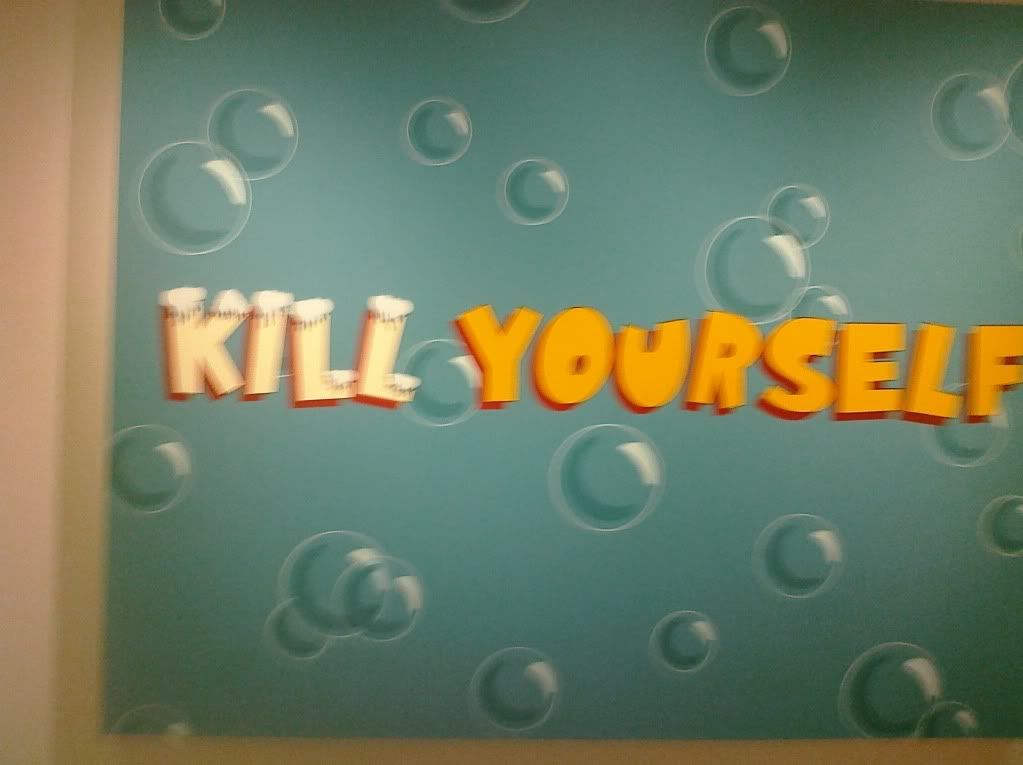
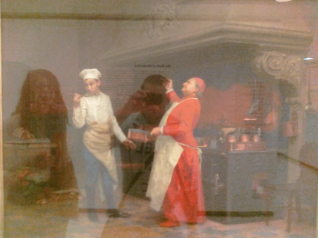
One artwork that made an impact on me was the oil on canvas 1952 Jackson Pollock work Convergence. This piece made an impact on me because of how big it was and the way the colors are splashed on to the work. Another art work that made an impression on me was the Vinyl paint on canvas 1989 work Kill Yourself by Nancy Dwyer. This piece made an impression on me because the words in the work are harsh and threatening, while the font of the letters and the surrounding background are bubbly and reminiscent of cartoons. One final work that made an impression on me was the oil on wood panel 1890 Jehan Georges Vibert work The Marvelous Sauce. This work left an impression on me because of how realistic it looks and also the expressions on the peoples faces in the work are interesting.
B.) Which artworks do I feel a connection with? Why?
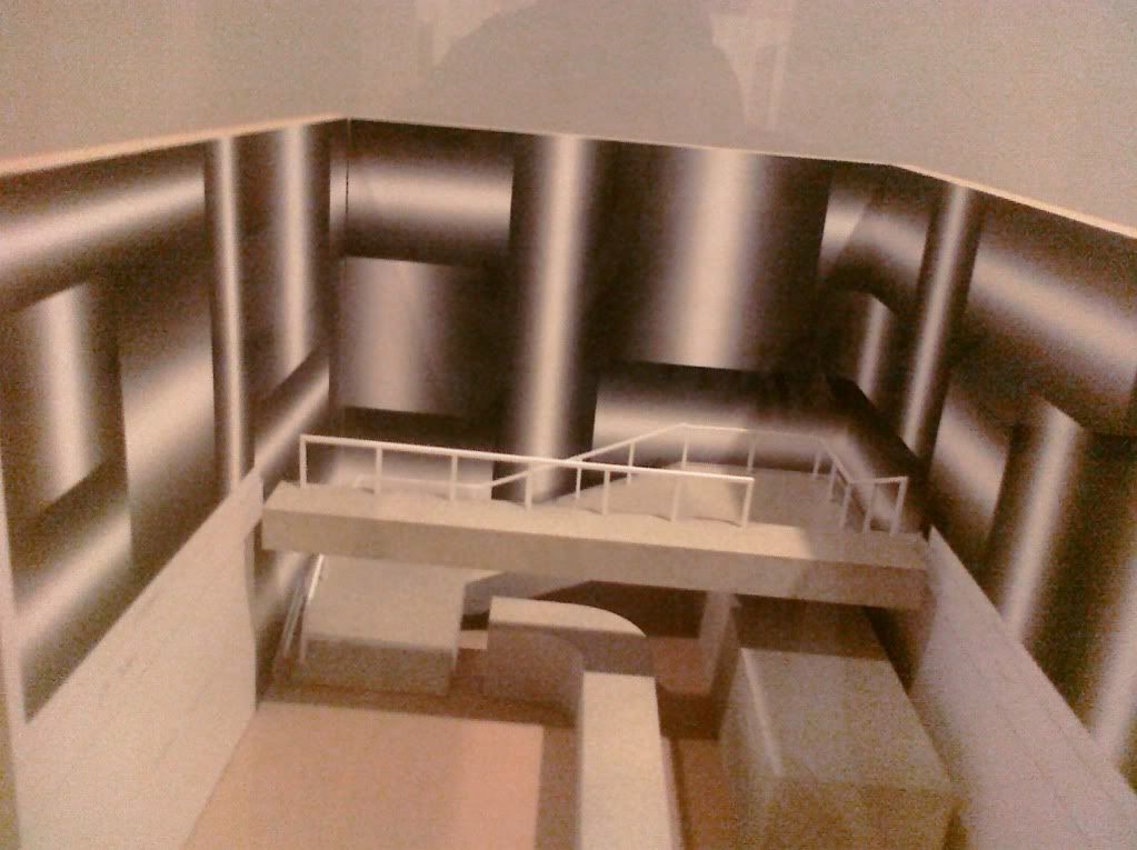
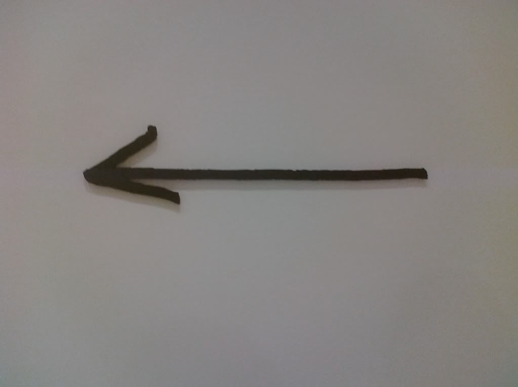
One work that i feel a connection with is Nine Arrows Leading You Around The Space by Micah Lexier. This piece was made with water-jet cut aluminum with enamel paint. I feel a connection with this piece because i feel that it was something that i participated in. The work consisted of nine arrows that were placed in different parts of the museum that led you from place to place. By finding all the arrows i feel that i participated and therefore have a connection with the work. Another work that i feel i have a connection with is the Maquette for the proposed instalation by Sol Dewitt i feel i have a connection with this work because it is something that i have read about in the book, and by seeing the proposal and other works made by him in person i feel i now have a connection with the piece. One final work that i feel a connection with is the 1888 oil on canvas The Old Mill by Vincent Van Gogh. I feel a connection with this piece because Van Gogh is one artist that i have learned a lot about, and by seeing his art first hand i feel a connection with the work.
C.) Which artworks would I like to know more about? Why?
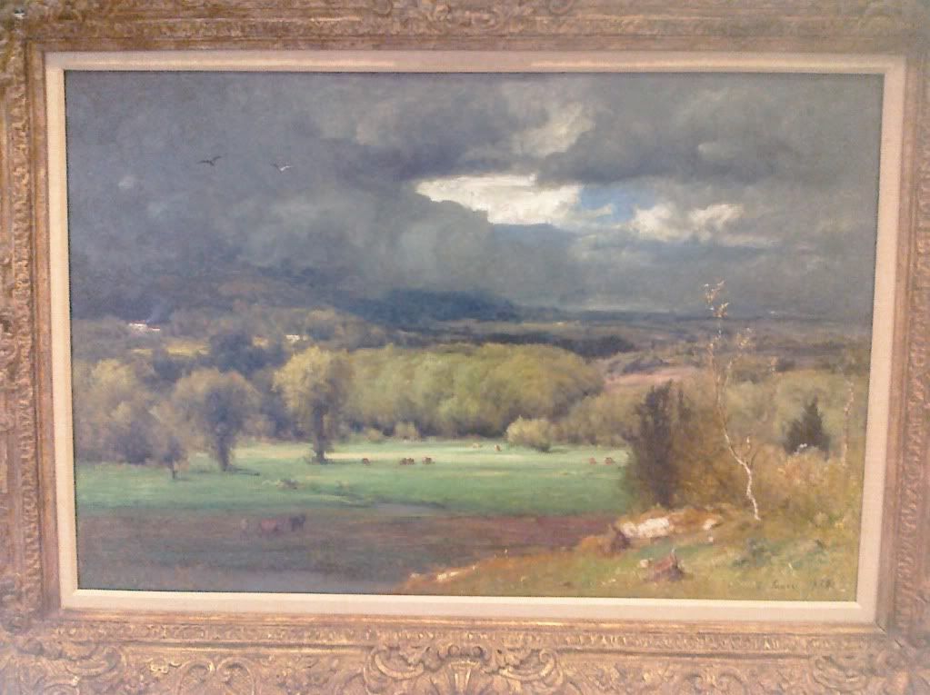
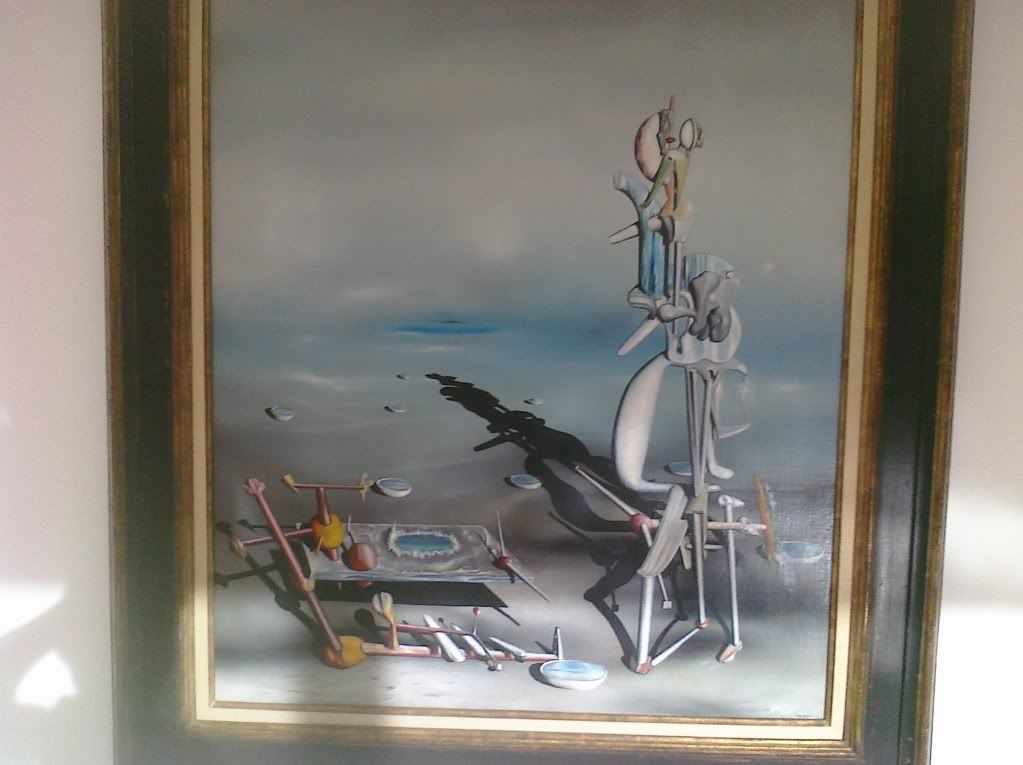
One work that i would like to know more about is the 1938 oil on canvas work New York Waterfront by Stuart Davis. I like the work and i would like to know more about the inspiration for the piece. Where exactly on the waterfront is this an abstract picture of? Another work that i would like to know more about is the 1942 oil on canvas Indefinite Divisibility. This work interests me because it is very abstract, and i would like to know if there is any meaning behind it. One final work that i would like to know more about is the 1878 oil on canvas The Coming Storm by George Inness. I like this painting and would like to know more about the artist, and to see more of this artists works.
Convergence
Kill Yourself
The Marvelous Sauce
Sol Dewitt
Old Mill
The Coming Storm
The New York Waterfront
9 Arrows
Indefinite Divisibility
Sunday, October 3, 2010
Friday, October 1, 2010
Logo Project
1. Discuss what you thought about creating your logo.
I enjoyed the process of creating my logo, because i like the amount of creativity that is needed to design and develop something that represent you. I also liked the process because graphic design is an area of art that i have alot of interest in, and i have taken a few classes on.
2. Describe the process: creative thinking skills and ideas you used in the logo creation.
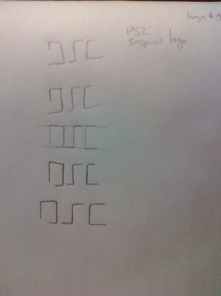
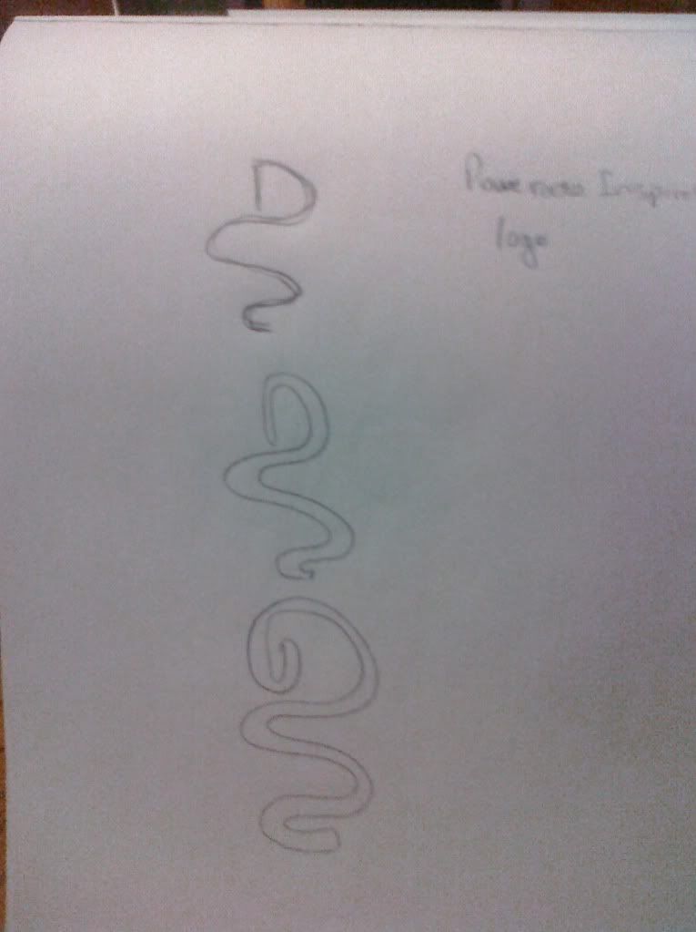
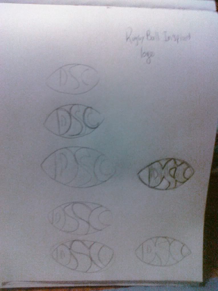
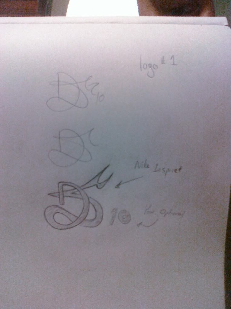
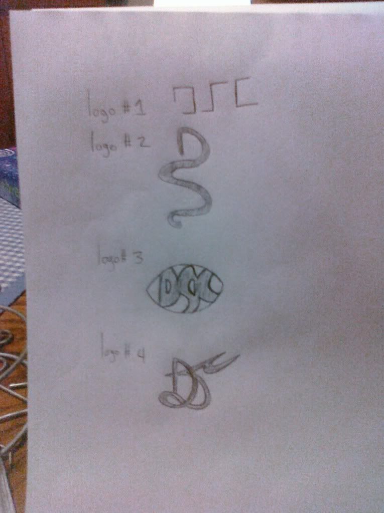
To create each logo i started with a basic idea i had based on a different logo such as Nike, Powerade, Rugby, and PS2. I then would create different versions of each basic idea until i developed something that i liked. I copied this process 4 times, and created 4 different logos.
3. What was the most important discovery you made in the creation of your logo?
The most important discovery thast i made in the creation of my logos is that not all designs work out. Something that may seems like a good idea at first can turn out not as well as you would have hoped.
4. What is the most important information you learned from watching the videos, powerpoint, and reading material for this project? What is your opinion of the videos?
The most important thing that i have learned from the videos, PowerPoint, and reading materials is about the process that needs to take place to create an effective logo. The thought and creativity that must go into a logo, and the trial and error that takes place to finally get to an end result. This is true for logos that are made to represent yourself, and also for design firms creating logos for clients.
MY LOGOS:
Logo 1
Logo 2
Logo 3
Logo 4
Logo Compilations
I enjoyed the process of creating my logo, because i like the amount of creativity that is needed to design and develop something that represent you. I also liked the process because graphic design is an area of art that i have alot of interest in, and i have taken a few classes on.
2. Describe the process: creative thinking skills and ideas you used in the logo creation.
To create each logo i started with a basic idea i had based on a different logo such as Nike, Powerade, Rugby, and PS2. I then would create different versions of each basic idea until i developed something that i liked. I copied this process 4 times, and created 4 different logos.
3. What was the most important discovery you made in the creation of your logo?
The most important discovery thast i made in the creation of my logos is that not all designs work out. Something that may seems like a good idea at first can turn out not as well as you would have hoped.
4. What is the most important information you learned from watching the videos, powerpoint, and reading material for this project? What is your opinion of the videos?
The most important thing that i have learned from the videos, PowerPoint, and reading materials is about the process that needs to take place to create an effective logo. The thought and creativity that must go into a logo, and the trial and error that takes place to finally get to an end result. This is true for logos that are made to represent yourself, and also for design firms creating logos for clients.
MY LOGOS:
Logo 1
Logo 2
Logo 3
Logo 4
Logo Compilations
Saturday, September 25, 2010
Project #2: Color Wheel and Value Scale
1. Discuss what you thought about creating the Value Scale and Color Wheel.
I found the process of creating the color wheel and value scale fun, but kind of tedious. I enjoyed mixing the colors and placing them on the wheel, but the value scale took time to get all the shades correct. All in all the project was fun and easy to complete.
2. Which media did you enjoy working with the best and why?
The media that i enjoy the best and am most comfortable working with is graphite or pencil. I feel that the pencil allows more control over where you are shading in or drawing. Whereas with the paint brush you don't have as much control and it requires a much steadier hand.
3. What was the most important discovery in the creation of these studies?
The most important discovery for me in the studies were the difference between the primaries and secondary colors, and how each color is made. Also the fact that using the primaries of red, yellow, and blue instead of cyan. magenta, and yellow can create different secondary colors.
4. What is the most important information you learned from watching the videos for this project? What is your opinion of the videos?
The most important information i learned while watching the videos for this project was the difference between the primary colors red, yellow and blue, and the primary colors of cyan, magenta, and yellow. I think the video was well done and very informative. It got its message across and didn't take along time to do so.
http://i188.photobucket.com/albums/z100/frozensolid45/AED1.jpg
http://i188.photobucket.com/albums/z100/frozensolid45/AED2.jpg
Saturday, September 18, 2010
Color Theory and Emotional Effects
1. Describe Color and it's effects on emotions. Use the appropriate vocabulary of color in your posting.
Color is a visual attribute of things that results from the light they emit, transmit or reflect. Color has a very large effect on the emotions of people. People have complex emotional responses, and have either cultural or individual association with the colors. Colors can have contradictory cultural association, an example of this can be seen with the color red. Red can evoke the emotion of anger or danger, but can also evoke love or compassion. Color and emotion works best when there is context to provide clues to its meaning. examples being a red stop sign, or a red valentines day car. Both are red, however, one evokes caution while the other love.
2. What is a theoretical aspect of color that most intrigues/fascinates you? Why?
The theoretical aspect of color that most intrigues me is emotion. This aspect intrigues me because of the different ways color can make people feel, and the different emotions they evoke in people. The fact that a certain emotion is brought up from a color interests me because i am a marketing major. As a marketing major i have also learned that advertising uses colors to evoke emotions in consumers, thus leaving them feeling a certain way about a product.
3. In the Color video, what made the biggest impact on you in regards to color and it's effects on emotions?
In the color video the thing that made the biggest impact on me was the works made by Mark Rothko. His paintings with just colors (intense reds and maroons) were created to evoke certain emotions into people. The paintings were intended for a restaurant but the artist became mad at the owners. The paintings he made were meant to evoke a feeling of being trapped, and to make the people in the restaurant feel uneasy.
4. In the Feelings video, what made the biggest impact on you in regards to color and it's effects on emotions?
In the feelings video the differences between the two painters Goya and David, and what emotions they wanted to induce impacted me the most. David believe feeling is art yearning to be better, whereas Goya believed the opposite, that it was a murderous drive and the worst of humanity. The colors the artists used show how they view feeling and depict their differences. Goya used very dark colors that stimulate the fear and anger emotions and David used much lighter and happier colors.
AED Project 1- Slide Show
Unity: To show unity i took a picture of cups all lined up together. This creates unity because all of the cups together create the parts of the whole piece.
Variety: To show variety i took a picture of a cluttered desk. The many shapes and colors found in this picture help to create variety.
Value: To create value i took a picture of a person sitting in the light from a window. The shadows and beams of light that dance across the subjects face create value in the picture.
Texture: To create texture i took a picture of a furry rug. I belive the way the picture looks really gives the viewer a "feel" of the rug.
Balance: I used the mirror in my picture to achieve balance between the markers and the menu.
Proportion: The picture of the hallway creates proportion because as the viewers eye moves down the hallway the doors seem to get smaller.
Rhythm: The repeating shapes of the bed spring works to make rhythm in the piece.
Shape: The square shape of the quilt is defined by the stiching and the fabric. This creates shape in the picture.
Line: Line is created in the picture by the railing that draws the viewers eye towards the stairs.
Harmony: The uncomplicated look and similar elements in the picture of the leaves creates harmony in the picture.
Form: The picture of the bed frame, though abstract, has cubes and other forms within it. This creates form in the picture.
Color: The color green is expressed in my picture of office supplies.
Emphasis: The close of of the subjects face creates emphasis and draws the viewers eye towards it.
Movement: Movement is expressed by te person in the air while the others in the picture are on the ground. The persons in the airs body position also helps to create motion in the piece.
Space: The area created behind the bottle shows space in the picture.
Project 1 Slideshow
Thursday, September 9, 2010
Art Class Post #2
1) For each video list/discuss the key concepts you learned.
The key concepts in the first film Aesthetics: Philosophy of the Arts are the different view of aesthetics that philosophers have held over time, and how the view of aesthetics has changed and evolved over time. In the second film CARTA: Neurobiology Neurology and Art and Aesthetics the key concepts are that of the scientific view of aesthetics. The key concepts are the evolutionary origin of art and aesthetics, the processing of visual images in the brain, and the rules of art.
2) Which philosopher's theory on aesthetics do you feel is most important? Be sure to mention the philosophers name, era (time in history), and contrition to the aesthetic theory in your response.
3)What do you think about Changeux and Ramachandran scientific view of aesthetics and art? What was the most interesting fact you discovered from each speakers lecture?
I like the scientific view of aesthetics and art that Changeux and Ramachandran have. I like it because it explains why we find some things more aesthetically beautiful then other things, and explains the processes that take place in our brain to create this perception. I particularly liked the eight laws of art proposed by Ramachandran, and the evolution of art in humans discussed by Changeux. The laws show how and why somethings are more aesthetically pleasing, and Changeux's lecture showed how humans went from the discovery of tools to the discovery of artistic composition.
4) How do the videos relate to the readings in the text?
The videos relate to the reading in the text because they elaborate on what art and aesthetics is. the videos give the views held by philosophers and those of scientists to help describe and explain them.
5) What is your opinion of the films? How do they add depth to understanding of the topics in your reading?
I enjoyed the films, but i preferred the 2nd film over the first. In the 2nd film however, the first speaker Changeux was hard to understand at times, and because of this a little bit hard to follow. the films added depth to the understanding of the topics in my reading by elaborating on what art is, why art is created, and the aesthetics of art. Both films provided different views from scientist and philosophers that clarified each of these three points.
Friday, September 3, 2010
My 1st Post
1. How was the process of creating the GMail account and setting up the Blog?
The process of creating the GMail account and setting up the blog was pretty simple. I have already done both before so it was just a matter of doing it again.
2. What do you expect to learn in this course?
In this course i expect to learn more about art. I expect to be taught about different techniques used in art, and the different materials that can be used to create pieces. I also expect to learn about different artists and their works, and how to evaluate and critique these pieces.
3. How do you feel about taking an online course?
I feel that taking an online course is good because it doesn't require you to be on campus all the time, but i also feel that it is easier to slack off and requires more discipline then a normal class. If you don't keep up to date it will be easier to fall behind then in a traditional classroom setting.
Subscribe to:
Posts (Atom)